I have been using Claude Code in my daily work for quite a while now. So I knew that it could help a lot with my own blog as well. I asked, decided and checked, it read the documentation, wrote most of the code, and we both tested. Every topic got its own Git branch, so I could review (and if needed, throw away) the changes separately.
Let’s start with the update!
The first step was updating Astro from 7.0 to 7.3. This alone went smoothly, but I wanted to be sure, so we generated the site both before and after the update and compared the results.
And it paid off: we found that about a third of the posts showed the wrong time. It turned out that the bug was caused by the RSS script I inherited from the Dante theme, which modified the dates of the posts. The new Astro builds the site in a different order, so the problem showed up now. After the fix the dates are correct again. (And the current version of Dante doesn’t have this bug anymore, so I didn’t need to send them a bug report.)
While checking the feed, it also turned out that its links pointed to the /blog/… paths I deleted when I switched to Astro. So RSS readers got broken links. Fixed.
There was also a new warning in the build for every MDX post. It’s a known Astro bug, the fix is already on the way, so until then I just hid this one warning.
Hungarian or English?
Most of my posts are in Hungarian, but the system marked everything as English. This was a problem mostly for screen reader users, because the Hungarian text was read with English pronunciation.
Now every post gets the language code of its own language, so search engines and assistive technologies get the right information. However, the Hungarian posts still have an English “frame” (eg. the footer), so the code handles these parts separately.
Since this setting lives in the same place, I also cleaned up the data of the posts I brought over from WordPress: about 2000 lines of unnecessary info are gone.
And if that’s not enough: until now the canonical URLs were generated incorrectly for every page (with an unnecessary .html ending) – this problem is gone as well.
Images, the Astro way
Astro has been able to optimise the uploaded images for a long time – if we let it. I couldn’t configure it the way I wanted so far (I already tried once with an earlier AI model), so I optimised every image myself, one by one, before uploading. But this meant that every device got the same image, no matter the screen size and resolution. Now Astro generates several sizes, and every device can get the ideal version.
Some tuning was needed, though: on big screens plain Markdown images loaded unnecessarily large files, because the browser didn’t know how wide the text column is. Now a small Markdown plugin tells it. And the (optional) captions are handled by a new Figure component, so the MDX posts stay simple as well.
Astro’s type checker (npm run check) was also added. On its very first run it found a real bug in the fresh image handling code – which we fixed right away, of course!
An admin UI, finally
For a long time I was also looking for a way to have an (optional) admin UI that makes creating posts more comfortable. But I found something I didn’t like in all of the well-known, popular solutions. In the end I chose Sveltia CMS, which I found by chance.
It worried me a bit that Sveltia is developed by a single person. But since it’s an add-on, and the blog works the same without it, the risk is small. (We pinned its version anyway, because it’s still beta.)
Preparing for Sveltia resulted in a little cleanup as well. I merged the separate description and teaser fields of my posts, because they only differed in how they were displayed. Now there is only one field and a switch.
A new look
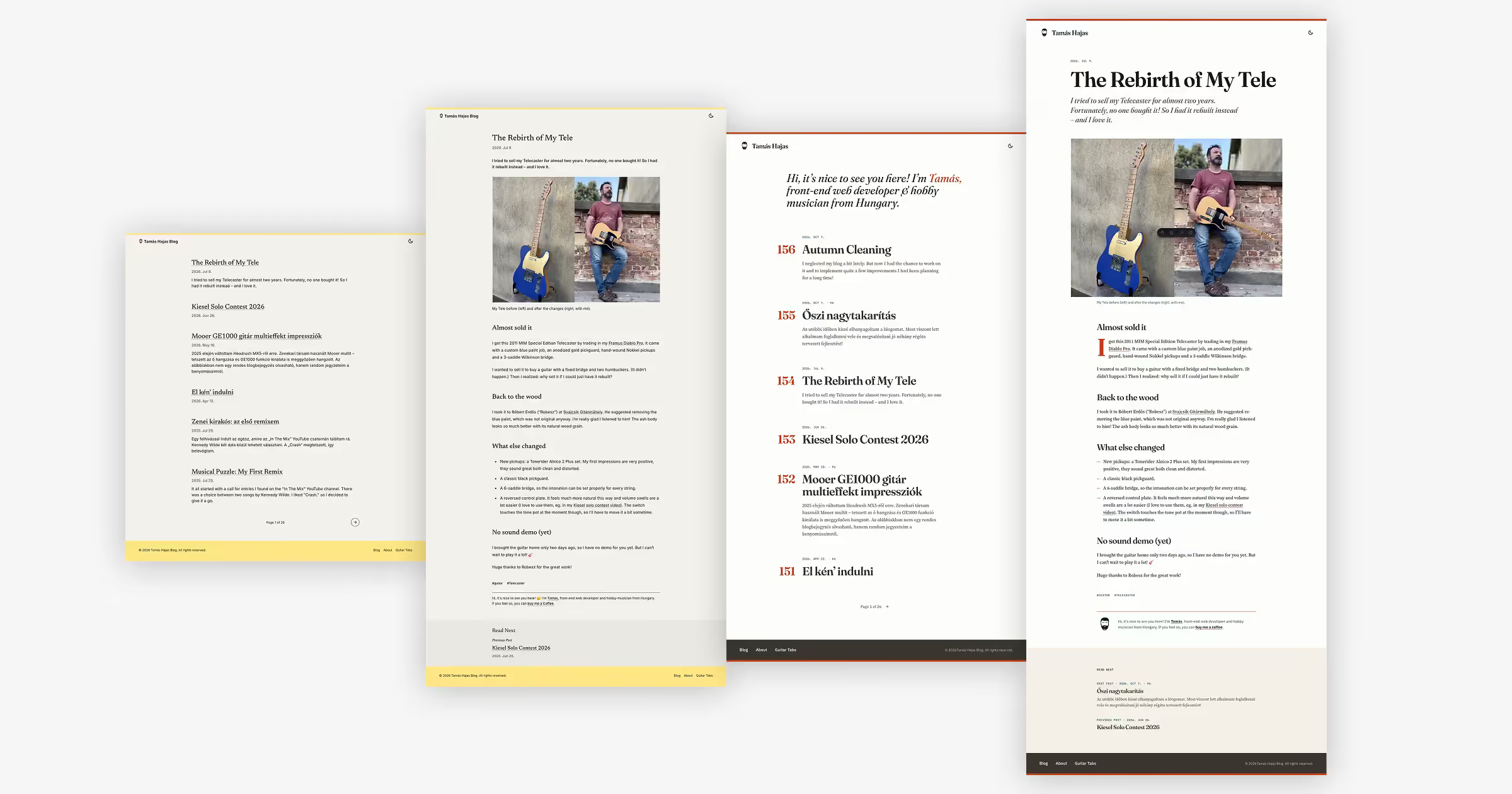
The most visible change: the blog got a new look. I started to feel that the old one was a bit old-fashioned, and I wanted something more modern. But I still didn’t want to build on flashy graphics, images or videos. So what remained is what is important to me anyway: nice typography – together with a thoughtful use of space and colours.
Before anything got into the code, we tried several directions in mockups. The ideas had to be changed six times before I was happy with the result.
Some of the new things:
- A red line at the top and at the bottom, a red drop cap, an (almost completely) white background and a warm, slightly beige “Read next” band (on the posts). So a more contrasting, a bit “louder” look than before.
- The old emoji was replaced by a new, simplified face graphic (which still refers to me) in the header and as favicon.
- Fraunces for the titles, Source Serif 4 for the text and the IBM Plex font family for the smaller elements.
- Much bigger, “bolder” font size for the headings.
- Red running numbers next to every post on the homepage. I asked Claude for “spice” ideas, because I felt that no matter how much we adjusted things, the homepage was simply boring. It gave me five suggestions, this one won.
To be continued
That’s it for now, but I still have more ideas. They will come as well, as time allows. Thank you for reading, and come back next time too!